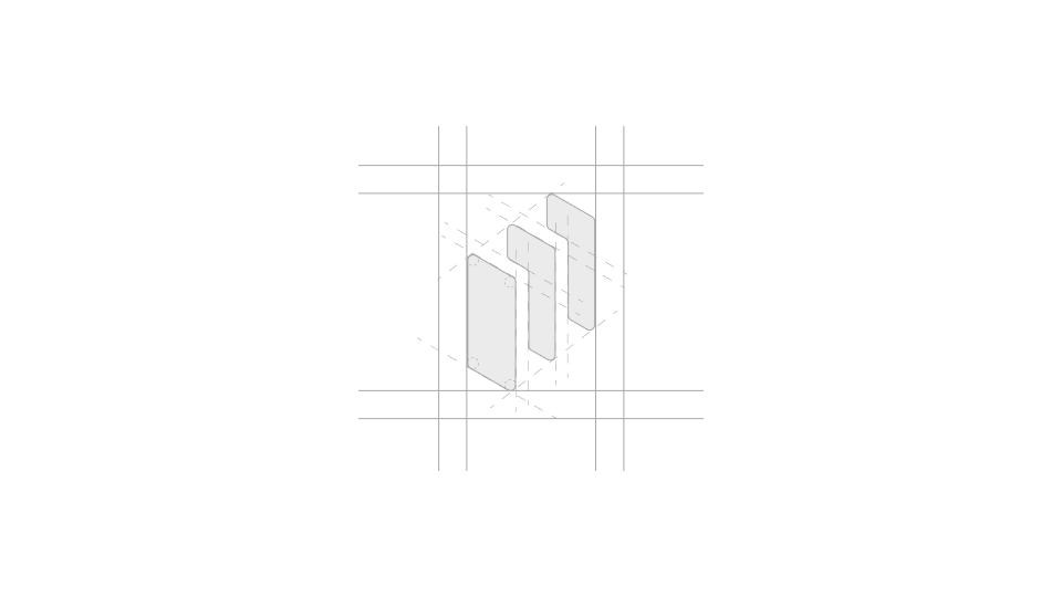
The chosen logotype features three rounded rectangles in isometric view, symbolizing both mobile devices and madvertise’s presence across three countries, while also referencing the in-house “BlueStack” solution. The puzzle-like arrangement represents the brand’s commitment to finding the best solutions, and the blue gradient maintains a visual connection to the previous logo.
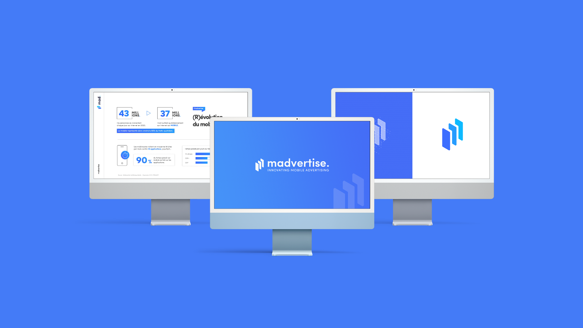
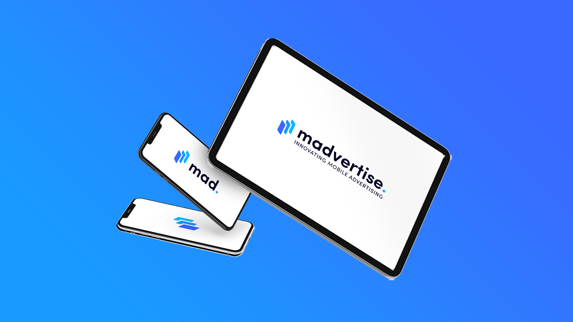
A responsive logo is crucial in today’s multi-device world, ensuring the brand stays recognizable and effective on any screen size. This adaptability enhances user experience and maintains consistency across all platforms, from desktops to mobile devices.